Room Transitioning – Connecting Rooms with Color
One of the biggest struggles in design for the new age is creating a sense of unity or cohesiveness in a home while also allowing for individuality. With new developments and cookie-cutter home construction, it’s an easy trap to have your home look just like everyone else’s around you. And while we love all the growth and expansion, we stand firm in our belief that each home is unique and should be representative of those that live there. That said, we often have clients reach out to us for guidance on making their home stand out.
With each project, we aim to capture a person’s personality while also making the interior of the home have a pleasing flow. It is within this realm that color choices and room transitioning is imperative. Without these considerations, a home can look harshly chopped up from room to room rather than be a harmonious sanctuary it is meant to be.
Read on for some things to keep in mind when styling a room. These design concepts will help ensure that your own home has a sense of uniqueness while also creating continuity.
Choose a Home Color Palette
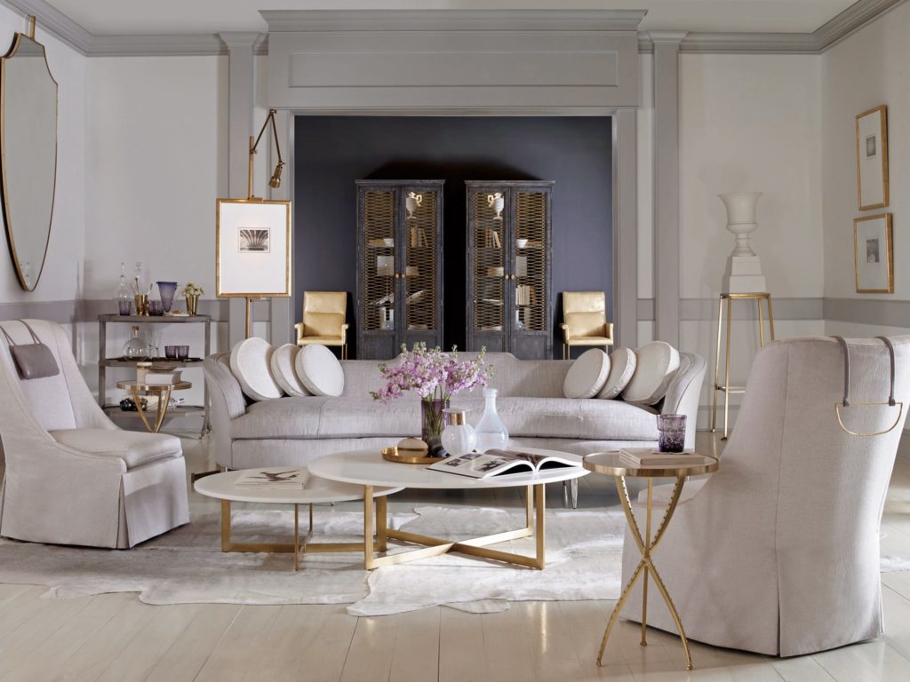
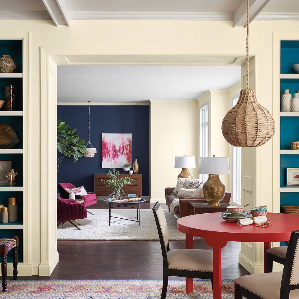
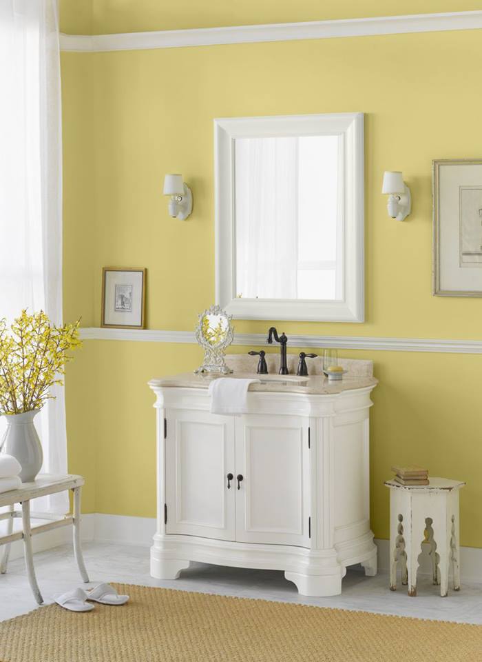
Start by choosing an overall home color palette and crosslink colors from room to room. Choose 1-4 colors for the interior walls with two of those being neutral tones that you can use in every room. For instance, anchor with white or cream trim and use tan as your other neutral you can use in your floor, wall or furniture choice. Then use the remaining one or two colors you choose in varying hues of each to play with in each room. For instance, if you choose blue, use lighter blue in your entry way, a grey-blue in the kitchen and a navy-blue accent wall in the living room.
Working within the same color family will help create steadiness in the overall home design. Once you have a general color scheme in mind as well, it will be easier to find pieces of furniture or accenting rugs to help you transition from one room to the next.
Sightlines
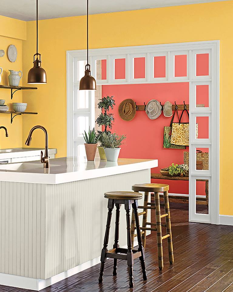
When deciding on overall room color or large accenting furniture pieces, take note of your room sightlines. Ask yourself, what other rooms do you see from each position in your home? For instance, if standing in the kitchen, do you see into the dining room and family room? If so, then the cabinetry, floor, furniture and wall colors for those three rooms need to flow together. Ensure your living room carpet matches the kitchen floor and your cabinets match your dining room table and so forth.
Coordinating the varying hues from all the angles and rooms will help the home feel more cohesive.
Look to Unifying Aspects
Create continuity by looking at the fixtures in your home that are present throughout. Anchor each room with the same color and kind of trim, molding and ceiling. Use the same carpet and hard flooring throughout. Don’t make the mistake of choosing a different tile or laminate in the laundry room than you would in the bathrooms. Choose the same or similar door, hardware and lighting types in each room.
By using matching permanent pieces, the entire house will feel more anchored together.
Pops of Color
If you love color as much as we do, then you’ll find it hard to not go overboard with your favorite hue; but in a home design, it’s better to be reserved with your color obsession. In open areas, refrain from painting ALL the walls in that bright poppy red and choose to bring in that color into your accessories instead. Add pops of color to the room by using throw pillows, vases, wall art or arm chairs and paint your walls another, more neutral shade that can easily be paired with for an adjoining room.
It is also easier and will keep the flow of a home more consistent if you choose to use bolder hues on walls behind closed doors. Powder rooms, small bathrooms, laundry rooms and play rooms that are directly out of sight or can be closed off are great rooms to paint in your favorite hue. Vibrant, bold choices in “boxed off” rooms can be electrifying and a means for allowing your creativity to come out.
Transitioning from one room to another can be a daunting task but taking into consideration each of these concepts will help build a home design based on consistency and unity. For further guidance, one of our designers would love to help you with a color consultation.