Orange is the New Grey
Orange may be the new black on TV but, in our case, orange is the new grey. For years, we have been bombarded with grey everything in design. Grey walls, grey furniture, grey carpet colors. It’s what you see most in new builds or in designs where a “clean slate” is needed. It’s the “go to color” for nearly everything. And while we love grey for its transparency, a design sometimes just needs a little more oomph – a little more color. And for years, my designer mind has settled on an orange. In our own living room and kitchen, we favorite a terracotta copper hue and every day, I fall in love with the color more and more. And for those likeminded whom feed on color, orange may be what the doctor ordered for your own home.
Below, we showcase five of our favorite rooms we like to decorate with the lively hue. Grey may be the popular choice; but, orange will always in our eyes be the standout player and a color we hands down recommend.
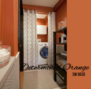
Bring some bold color to an unexpected place like this tucked away laundry room. The vibrant orange next to the colorless black and white brings a level of sophistication and character to this small, well organized space. If opting for a brighter hue like this in a smaller space, try to minimize the contrasting accessories. For instance, opt for clear glass jars similar to below to expand the visual eye. For a similar paint color, try Sherwin-Williams Determined Orange.
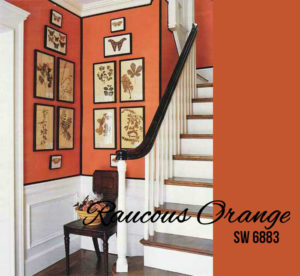
Welcome your guests in style with orange in the foyer or entryway. As the first color they see, the pulsating hue will set the tone for a lively visit. Pair with other neutrals like these bright whites and polished blacks for a deep contrast. What’s even more intriguing with an entry way design is that the orange can be used as a way to highlight the room’s architecture. Notice how the wainscoting and crown molding really stand out against the harvest shine. To get this look, try Sherwin-William’s Raucous Orange.
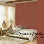
If orange may be too bright a choice for your own design, consider a more copper pigment for a relaxed and warm glow in the bedroom. Paired next to organic cottons and natural fibers like these accessories, a room can feel instantly welcoming and calming for winding down at night. The color shown below is similar to Sherwin Williams Sierra Redwood.
In this bathroom design, the orange tone creates an ethereal glow alongside the rich bronzes and granite vanity. For the autumn toned palette, try Sherwin-Williams Gold Coast.

Eat dinner in style when you pair a terracotta hue with grand ceilings and neutral bronzes and tans like that of this dining room design. One of our favorite hues yet, Sherwin-William’s Pennywise is a crowd-pleaser.