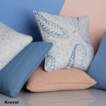
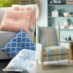
Every December, the top authority on color, Pantone unveils the “Color of the Year” for the forthcoming year. This hue is then observed as the most fashion forward color in both the interior design and high fashion industries. It is seen as a symbolic color for our surrounding cultures and world at that particular time. For 2015, the color of choice was Marsala – a deep burgundy wine color that demonstrated strength, richness and warmth. This year, Pantone surprised the industry by not only picking one color of complete contrast; but, by picking two: Rose Quartz and Serenity – a pale pink and pale blue. For the first time in “Color of the Year” history, the Company choose to blend the two shades to demonstrate the gender blur as of late in the fashion industry. And to also remind us all of the needed balance the two hues represent – the warmth with the cool. Balance in design as well as balance in our own lives.
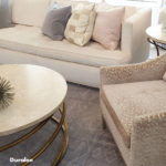
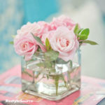
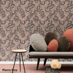
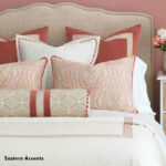
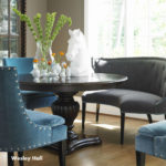
Also known as the “Love Stone” among crystals, the Rose Quartz color is most commonly recognized as the hallmark of unconditional love. The delicate pink conveys compassion, confidence and gentleness and is sure to give you an extra boost of enthusiasm. Use Rose Quartz expressively thought out your own home to transmit an air of luxury and class. Exchange your winter bedding for the soft pink hue or bring in the color sporadically throughout your home in your accessories, vases and/or wall art. Rose Quartz is also stunningly presented when draped on upholstered dining and living room chairs, benches, and sofas. We particularly favor the color when used as the focal point in a home’s living room or powder room.
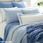
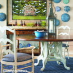
The second color of the year, Serenity, conveys exactly that of its name. The hue expresses a calming and peaceful state, one of warmth and tranquility. The whimsical blue suggests harmony and wellness in design and is sure to soothe even the most anxious eye. Welcome this relaxing tone in your wall color and linens. If used in the bedroom, this soothing hue will calm you before a nights’ rest. Like its counterpart, the pastel blue will also forever be a welcomed color in dining and living rooms.
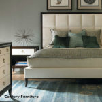
Together, Rose Quartz and Serenity convey balance and connection in the design world. The two link the masculine and the feminine in a vulnerable way that can be used in nearly every design style. For inspired color pairings, couple Rose Quartz and Serenity with other mid tone shades such as mint or rustic green, grape or lavender tinted purple, and ice or teal blue. The duo even works charmingly with most other pinks and soft yellows. They are our favorite when blended with brilliant whites, neutral creams, and greys.
However you choose to incorporate the Colors of the Year into your daily lives, they are sure to lift your spirits and welcome you into spring.
