While our furniture showroom is currently full of versatile, neutral colors, this year’s color of the year from the Pantone Color Institute is the vivacious Viva Magenta. The color institute has been choosing a color of the year for over 20 years with a panel of color experts who study and analyze current trends from fashion, beauty, technology, design, sports and home décor. Announced in December, the global color authority describes Viva Magenta as brave, fearless, joyous and a balance between warm and cool. Its “an unconventional shade for an unconventional time,” says Pantone.
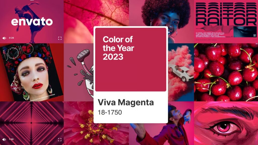
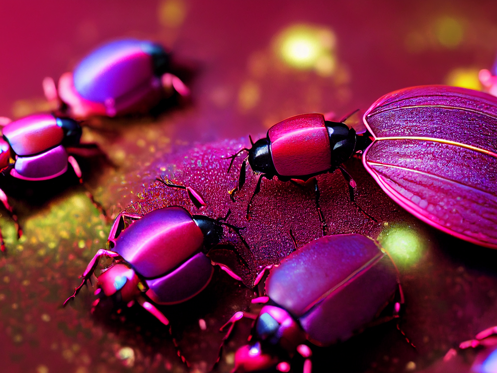
This is a hybrid hue between crimson, purple and pink and is from the red family, said to be a symbol of our existence in the physical and digital world. The color “merges the richness, warmth, and strength of natural matters with the rich, open horizons of the digital world,” Pantone says. “The result is a shade of red that expands our horizons of authenticity.” They also explained that the color has the “ability to answer our collective need for strength.” This magenta was inspired by the red dye called carmine derived from small insects known as Cochineals seen below.
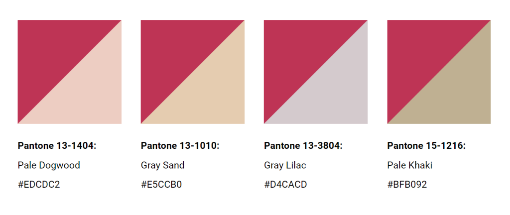
How can you use Viva Magenta? Pantone has provided a palette of complimentary colors that allow magenta to stand out:
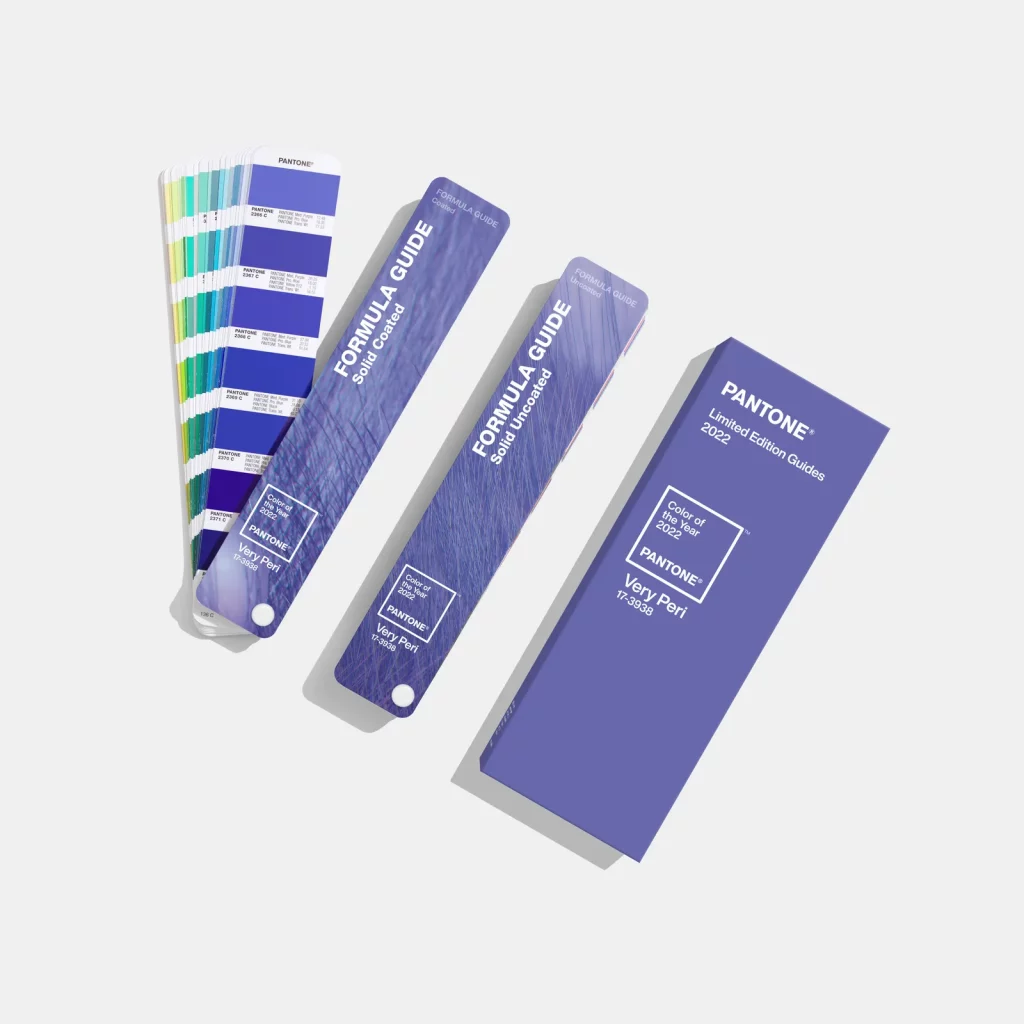
Last year’s color was Very Peri, a periwinkle purple characterized by inventiveness and creativity. Pantone recommended using the color on one wall instead of all four for those apprehensive to use so much color.
Additionally, paint companies have released their own colors of the year. Redend Point SW 9081 was named color of the year by paint company Sherwin Williams. They describe the color as warm, subtle, restorative, nourishing and intriguing. They believe this versatile hue will help “uplift spirits and uncover the beauty of any environment.” Too see the compatible colors to work with this color go to Sherwin Williams.
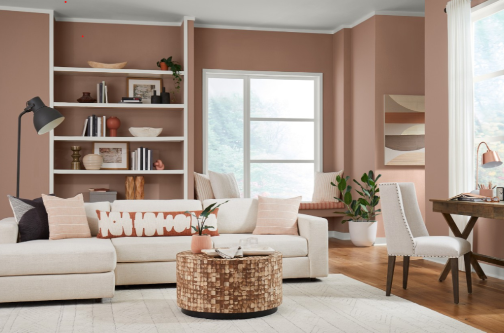
Top feature photo courtesy of Decor Interiors & More.