5 Steps to Create a Picture Perfect Photo Wall
We’ve all been there. We’ve all looked at a big open wall in our house and thought “what the heck do I do with it…” Stumped by the empty space, we question how to decorate it to make it more “homey.” Do we fill it with a big piece of artwork or mirror, shelves, or a photo wall? The possibilities really are endless with wall space; but, we at CIAO particularly love the look of photo walls. They make a space feel more welcoming and we believe they are like visions into the personality of the house and family living in it.
But the hardest thing about creating a gallery wall is figuring out where to start and deciphering what to include. Here, we give five tips and tricks on how to design the most fabulous photo wall and hope that after you read this blog, you can once again look at that big empty space in your house and say “Yea, I got this. This wall will look beautiful…”
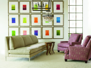 Find your Color Comfort – Having too many colors on one wall is like having 36 different ice-cream flavors to choose from. It’s too much and too busy and can overwhelm the wall design. The key to the perfect photo wall is to use one to three colors in order to focus the eye on the wall as a whole.
On the contrary, we have seen a variety of hues on a wall turn out well like this living room by Lee Industries. This wall works as the rest of the room design is simple with clean lines and more neutral shades. The vibrant pop of color intrigues the eye and makes the room more interesting. Should you love the neon or brighter hues, a photo wall like this one will work for you as long as the room around it is more subdued.
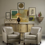 Plan Ahead – One of the greatest tips we can give you regarding how to build your gallery wall is to plan ahead. Gather all your items and decipher the order in which they will be hung before hammering away. One way to do this is to cut craft paper into the exact same sizes of your frames and tape them on the wall to give you a better visual of what the wall will look like when finished. This way will allow you to move the frames around until you find the perfect order without damaging your wall. There is nothing worse than hanging a photo to only have to re-hang it because it “just isn’t right” or the frame hangs slightly lower than its counterpart pieces. In this design by Lee Industries, each item was collected prior to being hung on the wall to create this unique triangular shape.
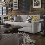 Mix and Match – Your wall doesn’t necessarily have to be perfectly shaped with twin like pieces. We often find that the most interesting walls are those that are displaying a variety of items in differing shapes and sizes. Have fun with your décor and pair an oval shaped mirror with square frames and rectangular shaped artwork. Love hearts? That’s just fine. Incorporate your favorite pieces for a more eye-catching statement. The key with varying shapes and sizes on a wall is to repeat them in a pattern. For instance, center your framed photo between two circular objects or follow a simple pattern of a rectangular frame followed by a square one. We especially love the antlers and chalk board motif in this design by Vanguard Furniture.
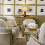 Keep it Organized – The best photo walls illustrate both symmetry and the use of lines in the design. Regardless of the shapes of your wall objects, try to place them so they are near symmetrical from left to right and top to bottom. Ensure that one side of the wall is not “heavier” than the other or that all your liked shaped objects are not in one cluster. Try to also create a visual line in your design to help center the eye when looking at the wall. In this Lee Industries design, the vertical and horizontal lines are obvious and create a more sophisticated image.
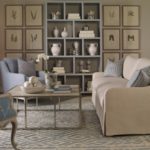 Create a Theme – Create your picture wall using a series of similar artwork or photos like this Vanguard Furniture living room. Every frame and white space is the same but each black image is slightly different than the others creating a simple theme for the overall room. Create a theme using whatever you desire – varying artworks by the same artist, family photos year after year in the same pose or pictures in the same color tones. Aim to create some sort of consistency within your design and you will love the overall wall style.